Going beyond the GOV.UK Design System for MoJ Forms professional users
We’re reworking our classic Form Builder into an online application called MoJ Forms. To accomplish its mission of creating government forms easily and quickly, we realised we needed to not only use the GOV.UK Design System, but also to go beyond it.
Strength and limitation of the GOV.UK Design System
When designing user interfaces for the UK government, we’re privileged to be able to rely on the GOV.UK Design System. Built collaboratively over the years from design and research work done across government, its usability and accessibility is world leading (and often reused including by the NHS). Together with design principles from the Service Manual it enables teams to release well designed services faster.
Yet no design system will ever “solve” all design, for all people or use cases. As with any design, the design system is itself a solution to a specific problem. It aims to help create services that anyone can use. “This is for everyone” is a design principle: “We’re designing for the whole country, not just the ones who are used to using the web”. Most government services are also used briefly and rarely, so everything needs to be easy to do on the first attempt.
As such, effectiveness (getting as many people as possible to complete their task) is prioritised over efficiency (how fast they do it). This is absolutely the right trade-off for public services.
MoJ Forms target users are different: they are digital professionals. They will use our product more frequently, repeatedly, and as part of their job. Every minute spent using it is a minute they won’t have to do the rest of their tasks. So our tool has to be fast. The trade-off we choose in our designs need to be different.
MoJ Forms and the GOV.UK Design System
Our users and their needs being different from the general public does not mean we need to start from scratch, far from it. Most of the Design System components are still appropriate. Yet some of the interactions in our tool were slower and more confusing than they had to be, so we used new components that are not in the Design System to improve them.
MoJ Forms is a web application, not a website. While the underlying technology is the same, the level of interactivity required is not, and the experience needs to be closer to a typical computer application than a series of pages to browse through. So it is no surprise that some of the components we have added are classics of software design: inline editing, contextual menus and modal dialogues.
Inline editing
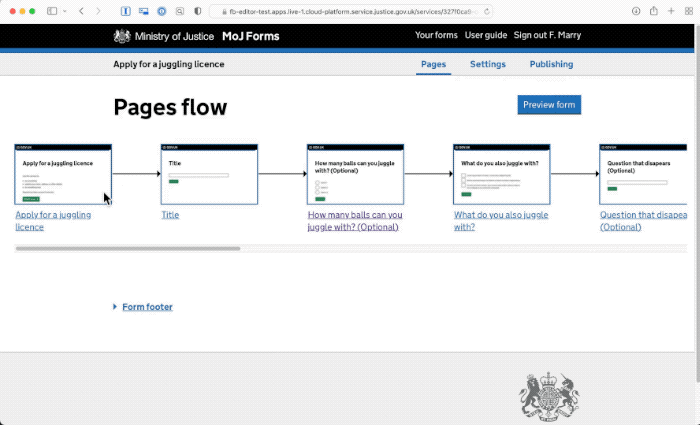
When we took it upon us to modernise our legacy Form Builder application, we realised it followed some of the GOV.UK design principles too strictly. For example, it took “one thing per page” too literally, and made you navigate to another page (and back) every time you wanted to edit anything in your form. While it was using the simplest of design patterns (a link to a new page), the interaction was slow and disorientating.
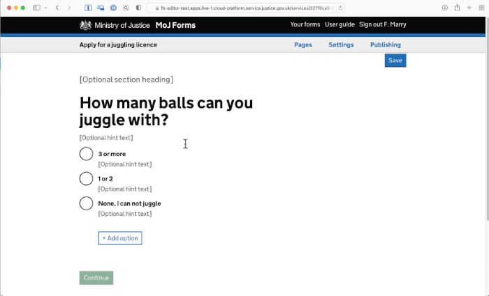
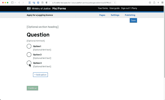
For MoJ Forms, we wanted the interactions to be much faster, and to avoid the confusion created by losing your sense of place by navigating back and forth. We’ve used a simple native html attribute (“contenteditable”) to allow the copy of each part of the form to be edited, simply by clicking it. As the styling is always present, it’s What you see is what you get, and there is no need to imagine how the form will look.
Hierarchical menus
Navigating through pages and subpages was also the way to select a template for adding a new page in Form Builder. These are using a standard pattern, simple radio lists, but are very cumbersome. 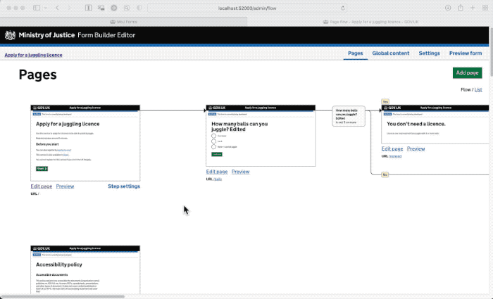
Software design has long established a pattern to pick an item from lists: hierarchical menus. These menus allow the user to quickly pick an option in lists and sublists, without needing to reorient themselves. So when adding a new page, it’s easy to click on the “add page” button and pick “Single question page” in the menu, then “radio buttons” in the submenu. This is much faster and easier than having to navigate to a full new page to see each level of options.
Modal dialogues
In some cases what we need isn’t just picking an option from a list, but answering one or several questions via a very short form. Modal dialogues allow us to do just that quickly. They’re great at capturing a short amount of information without losing your place.
Research
When we ran research on our new designs we leant that it wasn’t immediately understood that the form content could be edited in place. So we’ve added a focus on the first field when you open each page to make this editing capacity visible. Following that update we didn’t see any more confusion.
For the contextual menu and the modal dialogue, we had the feedback we were hoping for… which is absolutely none at all. No participant noticed anything unusual, and they could just use the new parts without giving them a second thought. While this can be seen as anticlimactic, this is the goal of our design: to be simply usable, and unremarkable. Eventually our participants had no issues using edit in place, menu and modal dialogues. These patterns have been in place for decades, just not on government sites so far.
Wider than MoJ Forms
The core tenant of User Centered Design is that your design should be appropriate for your users and their tasks. As our users are different from the general public for whom the design system is meant, it’s no surprise we had to adapt it.
Many of our MoJ colleagues also work on designing software for colleagues. These often involve case management systems and can be anything from managing transfer of people between prisons to reviewing power of attorney applications. Just like MoJ Forms, these systems need to be used by professionals, repeatedly and for long periods of time, so they also need to go beyond the GOV.UK Design System.
At MoJ we’ve got an internal Professional Action group working on coordinating our efforts toward standard components and a MoJ pattern library. We also know many other government departments have similar needs, so we’re reaching out to them too for example via the Designing Caseworking Systems Meetup.
Just like what was done for citizen facing services, there is a need for a coordinated way to join our effort across government to maximise the results and ensure we avoid wasting time reimplementing the same things over and over.
Meanwhile you can learn more about our new MoJ Forms product, or let us know in the comments of any similar patterns you have created for your own work.